My Blog List

Tuesday 11 December 2018

Naruto Shippuden Ultimate Ninja Storm 4

Naruto Storm 4 was released for the Playstation 4 on 4 February 2016. It is a fighting and action genre game, which is clear from the fight scene that seems to be taking place on the cover art. The use of quite bright saturated colours makes it clear this game is aimed at a younger audience, such as young teenagers and preteens. The use of shadows on the faces of the two people at the top, as well as the lack of colouring on their designs, shows that they are the antagonists. The rather plain colouring of the two characters at the top also help make the two at the bottom stand out, as their colouring is much more vibrant. There is also a figure in the background shrouded in shadow. This shows that they are the main antagonist, perhaps the mastermind pulling the strings on everything. The logo for the title includes an image of the two protagonists fighting. This establishes that even between characters we are clearly meant to like and support, there is still conflict.

It would garner attention from its target demographic solely by being a fighter and action game, genres very popular among teenagers. However, because of the lack of dull greys and bloodshed, it probably wouldn't be as popular with older teenagers and young adults. With the age rating being 12, this could limit its audience. However the Naruto games all have an advantage above other fighting games, which is that Naruto is already an existing franchise outside of the gaming world. It was originally a manga, which then became an anime and subsequently had video game adaptations of the story. While brighter colours and less bloodshed may not be as popular to older fans, this is not too much of a concern because the game is less targeted at fans of fighting games and more targeted at fans of the manga/anime. As Naruto was, at its peak, one of the top three most popular series in Japan, nicknamed "the big three", this means that there are already a lot of fans willing to play the game.

However, this is also a double edged blade. While having a pre-existing fanbase is better for selling the game, it also means there is a whole community whose standards they must meet.

Monday 3 December 2018

Newspaper articles


The BBC had a news article called "'The NHS turned its back on mum- and it cost us £250,000'". The title of the news article is a quote, meaning that it can be excused for being biased and emotional. By having the title as a quote, it allows for the heading to directly attack an organisation (in this case the NHS) without repercussions. The title has a very accusing tone, and garners sympathy from the readers. It also sets readers against the NHS from the beginning of the story, creating a sense of us versus them. Also, the fact that nowadays many people have had problems with the NHS due to budget cuts, the title is relatable on an emotional level, if not also a financial level.


The picture used for the news article is of the the family in question. The photo seems to have been taken at some sort of party, perhaps a birthday party, and all who appear in the photo seem happy and content. The photo is very ordinary- the kind of photo most people have probably taken with their families. This then garners further sympathy as it sets in people's minds the idea that this could be anyone. It serves as a reminder that they are average people and that what is happening does not target specific people, but can affect any of us.

The article then goes on to give a brief synopsis of the lives of Maureen Byfield, the woman whose care was not funded by the NHS, and her husband, who had to spend much of his early retirement caring for her. This humanises them in our mind. It moves them from faceless statistics to real people. It explains that Maureen was diagnosed with dementia in her early 70s and that her husband suffered health consequences as a result of the stress of caring for her. It then talks about how the husband had to move into a bungalow and Maureen went to live in a home and that the council and the NHS both refused to fund it. This plays into the audience's fears, as this is a worst case scenario in many people's heads. The idea of being left high and dry in a time of need is terrifying, and this news article only confirms that our fears are not as unfounded as we may have previously thought.

Despite the story being set against the council and the NHS, the family are later quoted as saying, "I'm not angry with the council. It is the system that is wrong" This shows that, despite the story revolving around this family so far, there is a bigger picture. As the BBC is run by the government, it tries to remain as unbiased on the whole thing, but there is a notable lack of blame being put on the government and more putting it on "the system". It also at no point acknowledges that the system is being upheld by the government and that they are the ones in the position to break it down and improve life for people in Britain.


The article then goes on the show the facts of the situation in the form of graphs. While a lot of the story so far has been opinion based, this adds the necessary statistics to let us know this is not a stand alone incident. The bar chart clearly shows that there is an immense lack of aid offered and that England is suffering the worst of the budget cuts. The article then briefly talks about councils being at  breaking point. The news article directly puts the blame of the system on the councils, and none of it on the government.

https://www.bbc.co.uk/news/health-46378353


https://www.theguardian.com/society/2017/may/24/nhs-faces-staggering-increase-in-cost-of-elderly-care-academics-warn-dementia

https://www.nursingtimes.net/roles/older-people-nurses/care-homes-struggle-to-meet-residents-needs/5042716.article

Monday 26 November 2018

Analysing newspapers

The mastered shows us that it is a news article by The Mirror. It is a left wing newspaper, which gives us an idea of where their opinions are coming from and what their biases are. The plug is about the Croydon tram accident. The main image is iconography of the Statue of Liberty, but instead of standing tall and proud with her torch, is hiding her face in shame. She represents freedom and liberty, so the imagery here is that those ideologies have failed. The dark clouds in the background show that there is more darkness yet to come as a result of this. The red sea could represent the potential deaths to be caused during Trump's presidency as a result of his bigotry. This shows the mood of the story. You can tell it is a very important story due to how much of the page is taken up by it. Other than the plug and newspaper title, the whole front cover is dedicated to the story of Trump's election.

The audience are persuaded to buy the newspaper by the use of imagery with the defeated looking Lady Liberty and the foreboding shadows in the distance. As well as that, the use of red and black gives it a very ominous look that draws people in, as people always want to know what has gone wrong. Negative stories draw people in more than positive stories, so by making it clear even from a distance that the newspaper is not presenting an upbeat story, they have guaranteed the attention of a larger audience than they might usually have.

The top title is "It's president Trump...". The ellipsis shows a level of disbelief and disapproval.

Friday 23 November 2018

Adidas campaign by Emilia and James

The product

In this campaign, we are advertising Adidas. The adverts revolve around the issues of social class, showing the juxtaposition between the rich athletes who wear Adidas products and the working class who wear it as street wear. In the past, Adidas have made advertising around equality to do with race. Now we are doing equality within social classes. We want to show that people of all classes can do great things and find success in their chosen area. Our chosen demographic is younger people,as we feel it is important for them to know that they are capable of achieving, no matter social class or background.
The white background and brighter lighting which is a staple of sports brand advertising, especially adidas.
We have also tried to imitate their style with the bright coloursand shapes around the image and a relatively minimalist design.

Monday 5 November 2018

Deadpool 2


They are not in any location. The background is block white, which shows that it is a comedy. By taking the characters out of reality, it highlights an awareness that they are not real and are characters in a movie. Its makes it look much more posed, like it's in front of a green screen. In fact, Deadpool is evidently aware that a picture is being taken, because he is shown posing for the camera. Deadpool has his hand firmly on the woman to the left's shoulder, showing that she is an ally. On the other hand, Deadpool holds his finger up to the guy on the right's head, in a gun symbol. This visual codes establishes the guy on the right as an enemy, as well as showing us that this is also an action movie. The title "Deadpool 2" shows that this is a sequel. That then gives us a promise of pleasure, as it is now expected to hold up to the quality of the first film. The second biggest bit of text on the poster is the tagline "He's not coming alone". As he was the only main character in the first movie, this already tells us before the movie is even out that there will be other main characters, which builds up anticipation and makes us more likely to want to go see its once it's out.


The trailer contains a lot of quick cuts, to emphasise the action of the movie, but it also uses this rapid pacing for comedic purposes.

Monday 8 October 2018

Use of media- Panic! at the Disco by James and Emilia


Expectation

As with all media forms, there is an expectation that the content be of a somewhat decent quality, and with a budget of more than £2. There is also the general expectation that the work consistently improve, with the newest work being better than the last work. Specifically for Panic! at the Disco, there is the expectation that Brendon Urie show up somewhere in the music video, either being sexualised or demonised.

Profile

Brendon Urie presents himself as classy, by constantly wearing suits in recent videos. When he is not in suits, he is usually half naked. This goes along with his star persona of being very sexual and open about it. He is also often presented as demonic. It begins in the music video "Emporer's knew clothes"when his character goes to hell. The satanic imagery then continues through to the music video for "LA devotee".

The fans are mostly made up of females between 18-24. Panic! at the Disco is also a popular band within the LGBT community, due to inclusive songs such as"Girls/Girls/Boys" and Brendon Urie's openness about his own identity as pansexual.

Feedback

Social media has allowed for better conversation between the fans and the artist. Fans can directly message their idols and hold a chance of getting a response. Panic! at the Disco benefit from being active online, as it means they can have a better relationship with their fans. Panic! at the disco have a fandom that make lots of fan fiction, fan art and other such ways that help promote the band. The fandom also make many memes, most of which revolve around the premise of the song "I write sins, not tragedies". 

Identification

The fans go by the name of "sinners, as Brendon Urie called them this once in an interview. It is very fitting considering how much satanic symbolism there often is in the music videos.
Image result for la devotee

Social media

Panic! at the Disco have a strong online presence. Both the band's main twitter and Brendon Urie's personal twitter are fairly active, tweeting every couple of days. Many of the tweets on the band's account are tagging other accounts, which allows them to garner wider attention from the audiences of these other accounts.

Soundtrack

For the movie "Suicide Squad", various musicians were hired to do record different songs, some brand new songs and some covers. Panic! at the Disco played a cover of "Bohemian Rhapsody"by Queen. This song was used in advertising trailers and in the movie. DC, while its movies still fall flat is decent, has a large audience. This then let them reach the viewing audience of the movie, as well as fans of the band Queen.

I Write Sins Not Tragedies cover

Back In 2017, the chainsmokers, another band with a fair amount of popularity, did a cover of popular Panic! at the Disco song "I Write Sins Not Tragedies". This received mixed reactions, as some liked the cover better than the original, while others completely hated the cover. All of this only aided Panic! at the Disco, as many who hated the cover went back to the original, which got Panic! at the Disco even more listeners. Even those who preferred the cover aided the band, as they still got revenue from the cover. Overall, this caused old Panic! at the Disco fans to return to their old love, while also allowing another band's fan base to be introduced to them and also become fans.

Tuesday 2 October 2018

Panic! at the Disco analysis by James and Emilia

I write sins not tragedies


It was released in 27 February 2006 and is the second single from Panic! At The Disco’s debut album, “A Fever You Can’t Sweat Out”.  The band’s reasoning behind the song was that at the time, all other bands sounded very similar. They decided to start the song with a cello, because rock songs rarely start in such a way and they wanted to let listeners know from the beginning that this is unlike any other song they’d heard.


The video begins in a church, and then cuts to Brendon Urie singing. It then makes multiple cuts between him and the church, and he then bursts into the church at the beginning of the chorus. The family in the stands all have face paint on and their eyes closed. This shows how they are choosing not to see the immediate issues between the soon to be married couple. Once Urie and his group of misfits enter the room, they blow powder into the guests’ faces, so they then get up and start dancing.

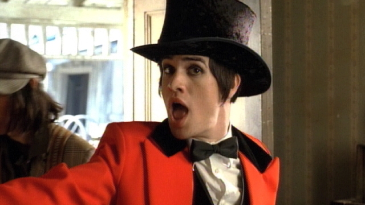
The church it is set in is an incredibly old, run down building which appears to be in the middle of nowhere. This could mean that it is set in the far south of the USA. Brendon’s star persona is a chaotic force, who is seemingly aware of all the details of the wedding arrangement. He is dressed half in a sort of wedding outfit and half in a circus ringmaster outfit. Only the groom’s side of the family are dressed as circus freaks, which could mean the groom thinks they are crazy for trying to ruin his wedding, when really they are aware of his bride’s misdeeds.

It is likely that Brendon’s character is the groom’s conscious, as he is torn between his family and his bride. At the end of the video, the groom becomes the ringmaster, showing that he has sided with his family.


This may also be the reason that, on multiple occasions, Brendon’s character covers his mouth to stop himself from saying something. This is because the groom is in denial and therefore, preventing himself from thinking such things.

Girls/Girls/Boys

It was released 8 October 2013 as the third single of Panic! At The Disco’s fourth album “Too Weird to Live, Too Rare to Die”. It peaked at number 31 on the Billboard Hot Rock Songs chart and was the final single released while drummer Spencer Smith was part of the band. The video was directed by DJay Brawner.

The video is one continuous shot, which changes between close ups and mid shots. It is a performance based music video, with Brendon Urie, the band’s singer, being the only person in the video. This puts the focus entirely on him, especially since the background is blacked out. He dances slightly, spinning around and swinging his arms about. He is completely naked and in multiple instances, the video teases panning below his hips, though it never does.

The video is highly sexualised, which fits with the lyrics. It explores the idea of casual sex and bisexuality. It emphasises the importance of holding a truthful sexual identity, as well as celebrating the courage to take it public. The song was originally written about Brendon’s first threesome experience and the music video is closely tied with the lyrics. Because he is naked, it shows that he is vulnerable, as he is opening up about his sexuality.

The song is evidently on the topic of a first experience, as shown by lines like  “And never did I think that I/ would be caught in the way you got me”. It is likely about a girl coming to terms with her sexuality, and the lyrics “I don’t want to hear you got a boyfriend” shows that the narrator is unconvinced by her attempts to hide it.

Death of a bachelor

It was released on 1 September 2015 as part of Panic! At the Disco’s fifth album, “The Death of a Bachelor”. It was a homage to Frank Sinatra, as Brendon Urie stated he had fond memories connected with his music.. He also stated in an interview with Upset magazine that he feels the song is “Very jazzy, very Sinatra esque… But then put it with this beat that sounds like Beyonce’s ‘Drunken in Love’”.


The music video is in grey scale, reminiscent of the era Frank Sinatra was from. It stars Brendon Urie in a suit, standing on a stage singing into a microphone. There are instances of panning away from Urie, close ups of parts of his face, and jump cuts in quick succession. During the song, Brendon Urie sings the line “I’m playing hooky”, which means to purposely avoid responsibility. This  shows that the narrator is avoiding his inevitable marriage, which will cause his ‘death’ as an available man. Lines like “I see the shadows on my face, People have told me I don't look the same, Maybe I lost weight” show that the narrator is now ready to mature as he takes his next step in life.

here is also a depressing undertone, with lines like “The lace in your dress tangles my neck” and “The death of a bachelor, seems so fitting for happily ever after. How could I ask for more?” seem to have sarcastic tones to them, as if the narrator is acknowledging how big an event marriage is, but honestly does not care much for it himself. It is as if he is mocking the concept that it is  an amazingly positive event in our lives.

Part of the song’s inspiration may have also been Brendon Urie’s marriage to Sarah Orzechowski . While the occasion was positive, it is likely the song was Brendon venting his insecurities and worries around getting married. It is also most likely tied in to Frank Sinatra, as he wrote many songs about love and romance, so perhaps this is a parody of that.